Microsoft corp. is an American multinational technology company founded in 4th April 1975. It produces computer software, personal computer and related services. It’s best known for its windows and internet explorer. Primarily users preferred microsoft windows and internet explorer. But the largest software maker has changed various logos throughout all these years. Let’s have a look on its logos.
All Microsoft Logos
1. First Ever Logo Of Microsoft
Both the founders of Microsoft, Bill Gates and Paul Allen, chose the first ever logo for their company. It shows the simple sans serif font. It was released in 1970s.
2. Redesign
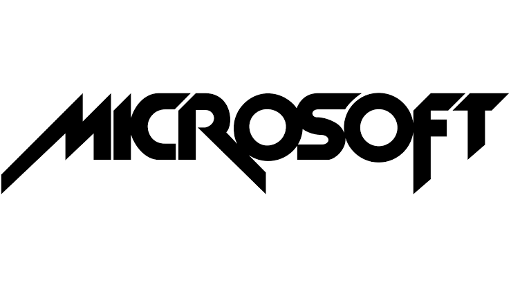
In 1980, microsoft decided to redesign their first logo. This design was inspired by the heavy metal band of that time. The name of the company was written on one line and letters were written with sharp angles with oily texture. It resembles the metallic logo.
3. Blibbet
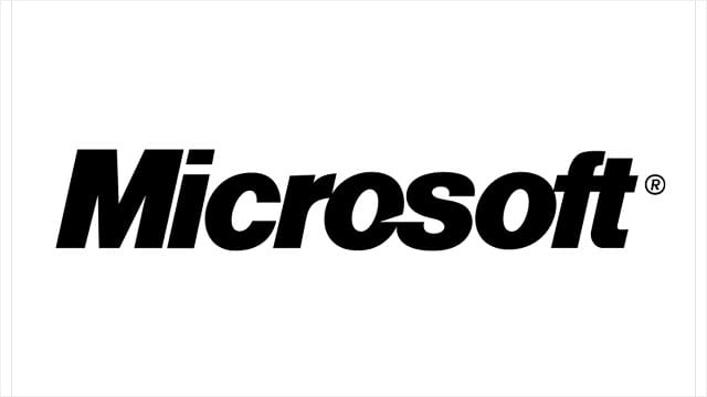
The 1982 logo was nicknamed as “Blibbet.” Microsoft now choose a corporate look instead of sharp edges or rocker side. The mid letter “O” here has some horizontal lines which makes this logo recognisable. This logo was loved by the microsoft staff and they didn’t even want to change it in 1987.
4. Pac Man Logo
This logo was formed in 1980s. They nicknamed it as Pac Man Logo. It was the longest used logo. Helvetica font was used in this logo and it is a well known and widely used logo till date. In 2006, microsoft just added their slogan in the logo instead of changing the whole logo. But in 212, they decided to change it as they want some flexible logo.
5. The Current Logo
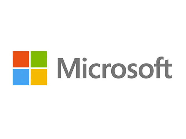
The recent and currently used logo of Microsoft was created in 2012. This logo was formed after various meeting. The bold amd italic font was replaced with Seoge UI font. And this is also their first colorful logo. Four colorful squares were seen in front of the name forming a square itself. And all the four square signifies the different features of Microsoft.
Stay with EveDonus Films for latest updates.


